
Introduction
Designer is a Microsoft Windows–based program that provides all the tools you need to create basic or sophisticated forms. You can create PDF or HTML forms with Designer. The workspace consists of many editors, views, and palettes. These palettes can float or be docked like they are on the right. You can configure your workspace in many different ways. This illustration shows a very common configuration of a Designer workspace with each of the major sections labelled.
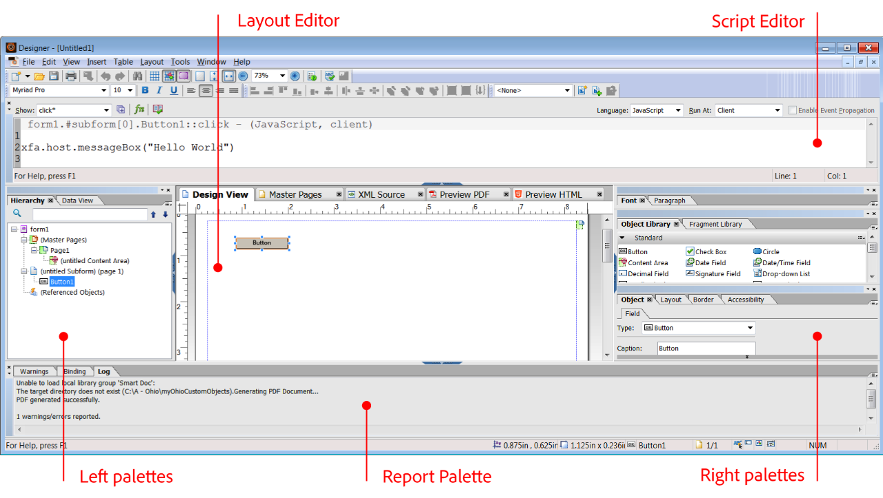 The AEM Forms Designer Workspace
The Layout Editor
The Layout Editor is in the middle of the workspace, and it contains five main views: Design View, Master Pages, XML Source, Preview PDF, and Preview HTML. You’ll see the Layout Editor when you have a document opened. The following is a brief introduction to each of the Layout Editor views:
- Design View: Design View is the main view in the Layout Editor and the one that you’ll use the most. This view displays a WYSIWYG view of your form and allows you to edit many of the visual properties of your form objects directly.
- Master Pages: The Master Pages tab shows an independent view of your master pages without any body page content. Master pages contain content areas that define the outer boundaries for body page objects.
- XML Source: If you don’t see the XML Source tab, you can select it in the View menu. This is your form in XML format. The structure of Designer forms is all XML, and as you make additions and edits to your form in Design View, this XML is updated in the background. You can quickly locate the XML source code for any of your form objects by selecting the object in the Hierarchy palette while the XML Source view is open. You’ll immediately see the XML Source view update, and your selected form object will be highlighted in the XML Source view.
- Preview PDF: You can preview your forms directly in Designer by switching to the Preview PDF tab. This tab uses your computer’s default PDF viewer, so if you have Acrobat, you’ll notice part of the familiar Acrobat interface wrapping around your form when you view it in this tab. You can see more of Acrobat by pressing Alt+F8.
- Preview HTML: If you don’t see the Preview HTML tab, you can select it in the View menu. If it doesn’t appear in your View menu, you’re likely using a version of Designer prior to Designer ES4. You’ll learn how to configure and use this view in, “HTML Forms.”
The Left Palettes
The area on the left includes palettes you’ll use to organize the structure of your form:
- Hierarchy: You’ll spend a lot of time using this palette to view and organize the objects and structure of your form. When you select an object on your form, it’s also selected in the Hierarchy palette, and vice versa. The Hierarchy palette displays your form’s objects in a tree view, which is a great way to examine and edit your form’s structure. Understanding this structure becomes particularly important when you start adding script to your form. The Hierarchy palette also displays referenced objects under the Referenced Objects node. A referenced object is an object that’s added to a form only when it’s required. Overflow leader and trailer subforms are examples of referenced objects. Whenever data flows across multiple pages or content areas, the overflow leader and trailer subforms are inserted into the form in the appropriate places.
- PDF Structure: This palette does not appear in the previous figure, but is available in Designer. It isn’t usually relevant for the XML Forms Architecture (XFA) PDF forms you’ll create with Designer. It’s more relevant for Acroforms and PDF documents because it displays a hierarchical view of the accessibility tags in these types of PDFs. You’ll use this feature in Designer if you’re working with PDF forms with fixed pages and fixed background artwork. You add accessibility features to XFA PDFs with the Accessibility palette.
- Data View: When you open a form that’s connected to a data source, the Data View palette shows you a graphical representation of your form’s data elements. You can associate your forms with data sources through a process called data binding. You can bind your form objects to an XML Schema, a Sample XML Data file, an Adobe Data Model, a WSDL (Web Services Description Language) file, or an OLEDB (Object Linking and Embedding Database).
- Tab Order: The Tab Order palette shows all your form objects in a list that corresponds to the order that a user will see when tabbing through the form. You can change your form’s tab order with this tool. The default tab order for Designer forms is left to right and top to bottom. If you don’t see this palette, choose Window – Tab Order.
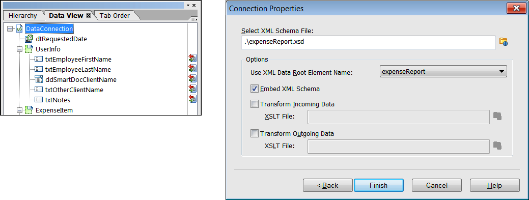 The Data View palette showing an XML schema binding
The Right Palettes
The area on the right includes palettes you’ll use to create and edit your form objects:
- Font: The Font palette enables you to edit the font family, size, and style of text in your objects. Many interactive form objects like Text Fields have both a caption and a value font property that can be set independently.
- Paragraph: The Paragraph palette enables you to edit the alignment, indents, and line spacing of your text.
- Object Library: The Object Library palette provides a collection of all available form objects. You can easily drag and drop form objects from this palette onto your form layout.
- Fragment Library: The Fragment Library palette provides a collection of your form fragments. Form fragments are reusable form parts that are saved as separate files. These fragments are ideal if you’re creating or managing numerous forms that use the same form parts.
- Object: You use the Object palette to modify the properties of your form’s interface objects. As you work with this palette, you’ll learn that it’s very useful and very adaptive. It enables you to edit and customize the most important aspects of your objects without having to provide any custom JavaScript. It’s flexible because it reconfigures its options based on the object you select. For instance, if you select a master page object, you’ll see the Master Page and Pagination tabs on the Object palette.
- Layout: The Layout palette works hand in hand with the Layout Editor. As you make changes to your object in the Layout Editor, they are reflected here, and vice versa.
- Border: Most of the information in the Border palette is self-explanatory. However, it’s important to note that these border properties affect the entire object, not just the editable portion of the field. The entire area surrounding your field and caption will be outlined with a border that you set with this palette. If you want to edit the border around your field, use the Appearance property on the Field tab of the Object palette.
- Accessibility: You can use the Accessibility palette to set Screen Reader properties for your forms. You can set several different options for each field on your form; you’ll learn more about this later.
The Script Editor
By default, the Script Editor is located directly above the Layout Editor and below the menu bar. You use this tool to create and edit scripts, and it’s usually docked at the top of the Designer workspace. Scripts are an important part of smart forms because they enable you to customize the functionality of your forms at both the client and the server level. You’ll learn more about this later in the manual.
The Report Palette
By default, the Report Palette is located directly below the Layout Editor and it’s usually docked at the bottom of the Designer workspace. This palette displays messages about your Designer file so you can correct issues as you work.
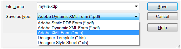
When you save your Designer file, you need to consider how it will be used. The following is a list of file format options available in Designer. You’ll learn how and when to use these formats throughout the training.
File Formats
- Adobe Static PDF Form (*.pdf): Saves forms as static PDFs based on the Acrobat and Adobe Reader target version specified in the form properties. Even if you specify a dynamic, flowable layout, this type of PDF form will still be static and will not rerender in response to user action. The fields on this form type can be interactive or non-interactive.
- Adobe Dynamic XML Form (*.pdf): Saves forms as dynamic PDFs based on the Acrobat and Adobe Reader target version in the form properties. In this case, a dynamic, flowable layout will rerender in response to user action. A user can add or remove table rows and even entire form sections with this type of PDF.
- Adobe XML Form (*.xdp): Saves forms in the native XML-based file format created by Designer. Use this option if you’ll be using and AEM Forms Server to render PDF or HTML forms. The form design can contain dynamic and interactive elements.
- Adobe Designer Template (*.tds): Saves the basic structure for a form as a template. It can contain components and settings, such as fonts, page layout, formatting, and scripts. Use it as a starting point for a new form.
- Adobe Designer Style Sheet (*.xfs): Saves the internal style sheet in the form as an external style sheet. Style sheets can be used to provide consistent formatting to all your forms. Style sheets can control the look of caption and field value text, the appearance of object borders and background colors, as well as the size and style of Radio Buttons and Check Box objects.
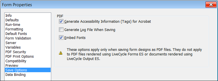
Options for PDFs
When you create a PDF, Designer provide a few additional parameters. You can select these parameters in the Form Properties dialog. Select File – Form Properties – Save Options.
 AEM Forms Designer PDF properties
This is a summary of each option and you will see more details in the training.
- Generate Accessibility Information (Tags) for Acrobat
This option is necessary to make your PDF forms accessible for devices like screen readers. - Generate Log File When Saving
This option will generate a log file which you can view in your Report palette. - Embed Fonts
This option will put specific font information in your PDF file. On one hand this is beneficial because you can be assured that your fonts will render properly on a form-filler’s machine. On the other hand, selecting this option makes your file much larger, which results in longer download times for your user. The performance advantage of smaller PDF forms is so substantial that you should think twice before choosing to embed fonts.
Standard Objects
Designer includes a library of standard form objects. These objects can be added to your form by dragging and dropping from the Standard Object Library to the Layout Editor.
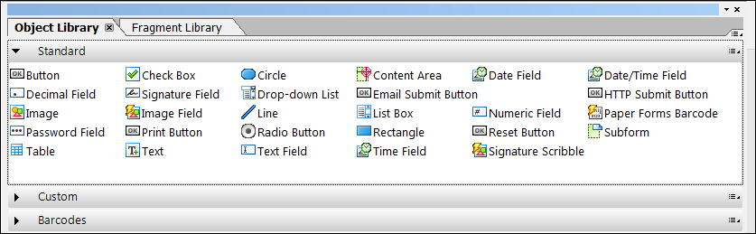 AEM Forms Designer Standard Objects
Text objects and Text Field objects
These are often confused by new students. The Text object is simply static label text. You can use it for labels or for paragraphs of text. It is possible to make Text objects dynamic by introducing floating fields.
Text Field objects are interactive and dynamic. They provide users with a way to enter data on the form. Text Field objects support all the following features.
- Captions and interactive data entry fields
- Multiline text
- Display and validation patterns
- Rich Text
Numeric Field objects
Like Text Field objects, Numeric Field objects should be used when you need to collect or display data. However, unlike Text Field objects, Numeric Field objects should be used for numeric data like floats, integers, and currency values. The following are characteristics of this object type.
- Numeric fields only accept numeric input.
- Numeric fields support display and validation patterns.
- Numeric fields are context-sensitive to the Locale setting. A U.S. Locale setting will use a comma to denote thousands (1,000.) while a German Locale setting will use a decimal point to denote thousands (1.000).
Image objects and Image Field objects
These objects are like Text and Text Field objects because an Image object is also static, and an Image Field object is also interactive. If you need a static image on your form, use the Image object. If you need an image that the user can change at runtime, use the Image Field object.
Drop-down List objects
A Drop-down List is an ideal form object for an enumeration or an array. It displays a list of items and facilitates the user’s selection of an item from the list. Consider these points about a Drop-down List.
- It accepts custom user entries.
- Although it initially displays only one item, once it is selected, it shows the entire list.
List Box objects
A List Box is like a Drop-down List because it can display a list of items and facilitate the user’s selection of an item from the list. However, keep the following points in mind when considering the use of a List Box.
- It requires more form real estate than a Drop-down List.
- It does not accept custom entries from the user.
Button objects
Designer’s standard Button object can be configured for any action your form may need. You can set the Control Type to Regular and write JavaScript on the click event to perform the functionality. Or, you can set the Control Type to Submit to configure a form submission. Here is a short summary of Control Types for the Button object.
- Select Regular for the Control Type to run the JavaScript in the click event.
- Select Execute for the Control Type to execute a database query or call a web service.
- Select Submit for the Control Type to submit the form’s data to a web service or other endpoint.
Specialty Button objects
In addition to the standard Button object, Designer also has these specialty Button objects.
- The Print Button initializes the Print Dialog box.
- The E-mail Submit Button submits the form to a specified email address.
- The HTTP Submit Button creates an HTTP submission of the form to a specified URL.
- The Reset Button removes all the data input from the form.
Radio Button objects and Check Box objects
Radio Buttons objects are part of an exclusion group, but Check Box objects are not. Therefore, you will likely use Radio Button objects in cases of mutually-exclusive choices and Check Box objects in cases where one or more choices can be selected. You can set the style of either object to be a square or a circle. You also have a variety of check styles for each object.
Date Field objects
The Date Field object presents the user with a visual calendar drop-down to select the date. Once selected, the date is automatically formatted according to the Display Pattern property of the object.
Signature Field objects and Signature Scribble objects
In short, the Signature Field object is used for PDF forms and the Signature Scribble object is used for HTML forms. The Signature Field object requires the end user to have a valid Adobe Acrobat digital signature to sign. The Signature Scribble object can be signed simply by scribbling a signature with a mouse or a stylus. If the end user has a touch device like an Apple iPad, they can sign the Signature Scribble object with their finger.